Logo, color, and type
The visual fundamentals of the Champion AI brand.
Visual identity summary
| Archetype | The Visionary Architect |
| Personality | Curious, Creative, Collaborative |
| Logo | Two mirrored leaf-halves of curving parallel strokes — growth, adaptability, biology + technology fusion |
| Primary color palette | White (#FFFFFF) + Champion Blue (#0033A0) + Imperial (#00004C) |
| Secondary color palette | Thames Dusk (#636363) |
| Accent color | Verdant Pulse (#00DC00) |
| Font | Roboto — Regular and Medium primary, other weights when warranted |
| Iconography | Lucide-style line icons, rounded caps, single color |
| Holographic UI | Translucent panels with three sharp corners and one rounded corner; cyan-blue default with multi-color when content benefits |
Brand slogan
Logo
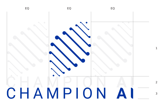
The mark.
Two mirrored halves curve toward each other, each formed by a series of progressively shortening parallel strokes that terminate in a small filled dot. Together they create a leaf-like silhouette — pointed at the tips, broader through the middle.
The form draws on two metaphors.
The leaf symbolizes growth, renewal, and adaptability — qualities that mirror the brand's DNA. The paired curving strokes also reference DNA strands, signalling the fusion of biology and technology that defines AI's role in human progress.
Proportions follow the Rule of Three — balancing wordmark and symbol to create harmony, simplicity, and memorability.
This measured ratio holds across all lockups; it is not adjusted for layout convenience.
The wordmark. "CHAMPION AI" in custom uppercase letterforms with generous letter-spacing.
"AI" carries slightly heavier weight than "CHAMPION."
 Primary — stacked
Horizontal
Primary — stacked
Horizontal
 On dark / gradient
 Favicons, app icons
Never reverse the order, swap the proportions, or recompose the lockup.
The mark is always above or left of the wordmark, never below or right.
The logo only ever appears in two colors: White (#FFFFFF) or Champion Blue (#0033A0).
| Background | Logo color |
|---|---|
| Dark | White (#FFFFFF) |
| Light | Champion Blue (#0033A0) |
The logo never appears in black, gray, green, or any color outside the two above.
Equal to the height of half the mark on all four sides. No copy, image, or graphic enters that buffer.
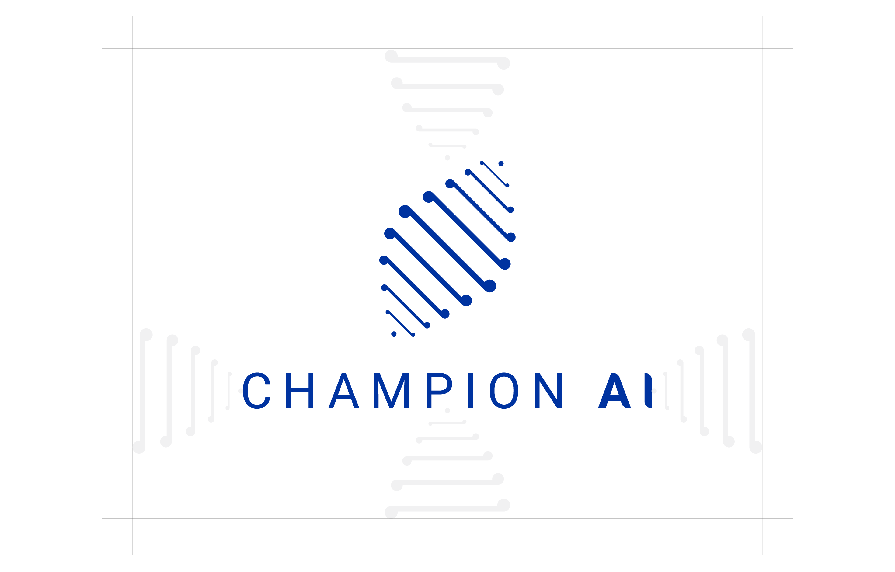 Stacked lockup
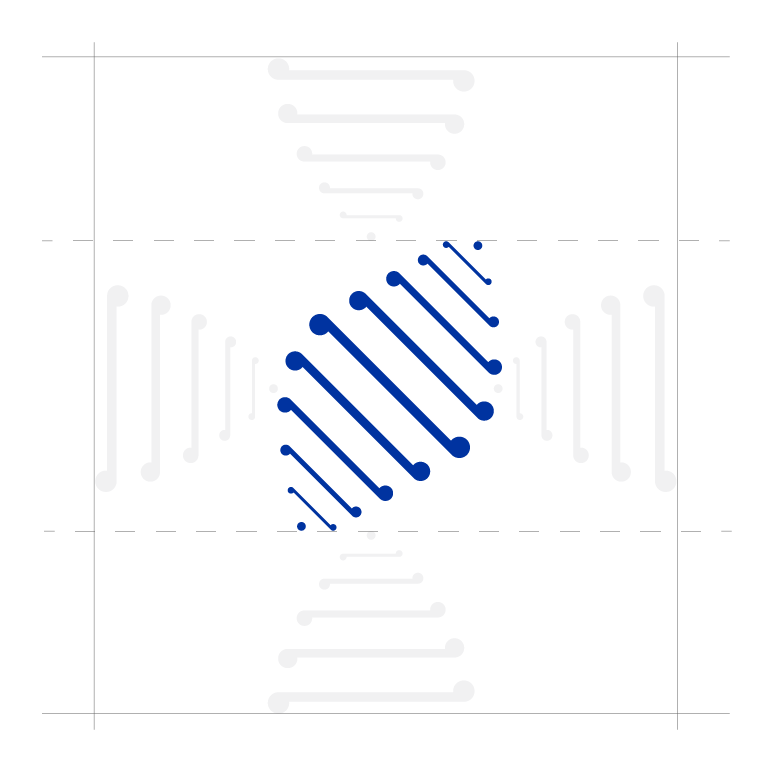 Mark only
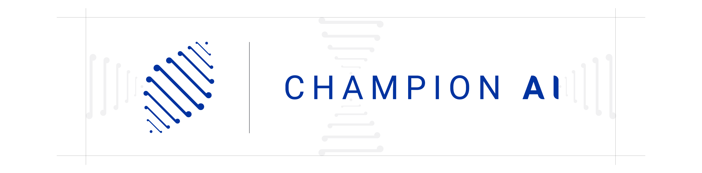 Horizontal lockup
 Wordmark only
The smallest the logo should ever appear in any context.
Logo don'ts
- Do not stretch, skew, rotate, or mirror the logo.
- Do not recolor outside the sanctioned colorways.
- Do not add drop shadows, glows, outlines, bevels, or gradients to the logo itself.
- Do not place the logo on a busy photographic background without a solid color or gradient overlay underneath.
- Do not box the logo in a container unless the container is part of a deliberate template (e.g., an Imperial badge in a corner).
- Do not animate the logo's individual lines/dots into something illustrative — the mark is not a mascot.
Color palette
Green, used selectively. Verdant Pulse can serve as an accent, button color, or section background — it's not off-limits. But it shouldn't dominate a layout, and it shouldn't appear in every asset. Default to blue and white first; reach for green when the moment earns it.
A balanced layout follows roughly: ~60% dominant surface, ~30% secondary surface, ~10% accent / call-to-action.
This is directional, not literal. The point is that one color carries the layout, one supports it, and one is reserved for the moment that needs to land.
Combinations to avoid
Typography
All typography uses Roboto exclusively.
Roboto is a strong fit for this brand because it combines modern clarity with approachable warmth, aligning with the company's philosophy of adapting and evolving with change. Its clean, geometric structure communicates professionalism and trust, while its subtle humanist curves keep it accessible and open.
As a highly versatile typeface family with a wide range of weights, Roboto supports flexible expression — from bold, confident headlines to clear, readable body text.
Primary weights — Roboto Regular (400) and Medium (500). These do most of the work: Regular for body, captions, and supporting copy; Medium for titles, headlines, and emphasis.
Size relationships (directional)
- Title is roughly 2–2.5× the body size.
- H1 is roughly 1.5–2× body.
- H2 is roughly 1.25–1.5× body.
- H3 is roughly 1–1.1× body, distinguished by color/weight rather than size.
- Body is the baseline.
- Captions / fine print sit at 0.75–0.85× body.
Always design with bold size contrast between title and body. Timid hierarchy is a hallmark of weak layouts.
Type rules
- Tracking: Roboto's defaults are correct. Do not letter-space body copy. The wordmark "CHAMPION AI" is the only place where wide tracking is intentional.
- Line length — the number of characters that fit on one line of body text. Aim for ~50–75 characters per line; wider than that becomes hard to read, narrower fragments the rhythm.
- Line height (leading) — the vertical space between lines of text. Use ~1.4–1.6× the font size for body, and ~1.1–1.25× for headlines. Tighter for headlines, looser for body.
Type don'ts
- Don't use all-caps for body copy (only the wordmark).
- Don't use italics for emphasis (Roboto Italic is not in the system). Use color or weight instead, sparingly.
- Don't underline anything except hyperlinks.
- Don't apply text effects (shadow, outline, glow, gradient fill).
- Don't combine Roboto with another typeface for "personality." Roboto carries the whole system.
Iconography
Iconography is functional, not decorative. It supports the content; it does not become the content.
- Line-based, not filled. Stroke weight ~1.5–2 units relative to a 24-unit icon grid. Filled or duotone icons are not part of the system.
- Geometric, with rounded line ends. Square corners on the outer silhouette, but stroke caps and joins are rounded. This matches the diamond mark's blend of precision + organic feel.
- Even visual weight across an icon set. All icons in a layout should look like they came from the same family — same stroke weight, same level of detail, same corner radius.
- Single color per icon. No multi-color icons. Color comes from the layout context (white on dark, primary blue on light, gray for tertiary).
Use Lucide (lucide.dev) as the default icon library. It matches the line-based, rounded-cap, geometric style and is open source. Phosphor Icons (regular weight) is an acceptable alternative.
Avoid: Material Filled, Font Awesome Solid, emoji-style icons, isometric/3D icons, illustrative icons, "tech" icons with circuit-board flourishes.
| Context | Icon color |
|---|---|
| Light bg, primary emphasis | Champion Blue (#0033A0) |
| Light bg, secondary | Thames Dusk (#636363) |
| Dark bg, all icons | White (#FFFFFF) |
| Inside a holographic UI overlay | Cyan-blue tint (see Holographic UI section) |
| Success / verified state | Verdant Pulse (#00DC00) — sparse |
- Inline with body text: match the cap height of the surrounding text (~16–20px).
- Standalone in a UI element (button, card header): 20–32px.
- Feature icons (hero benefits, section markers): 40–64px.
- Always sized in even pixel multiples (16, 20, 24, 32, 48, 64) to keep alignment crisp.
- Don't mix line and filled icons in the same layout.
- Don't rotate icons for decorative effect (a directional arrow can rotate; a generic icon should not).
- Don't recolor an icon to green unless it's a deliberate success/verified semantic.
- Don't add drop shadows or glows to flat UI icons (different rule applies inside holographic overlays — see below).
- Don't use icons as background pattern fill.
Holographic UI element library
The holographic AR overlay is a signature visual device for Champion AI. It signals "AI is present in this scene" as a layer of intelligence resting on top of the real world — not a sci-fi HUD, not a video-game interface.
- Translucent, never opaque. Overlays are a glass-pane material — you can see the environment behind them at 60–80% transparency.
- Ideally projected from a device. Most overlays read best when they appear to emanate from a laptop, monitor, tablet, or phone in the scene. This is the default — not a hard rule. Some images are pure UI without a device anchor.
- Content-relevant. What appears in the overlay should match what the asset is talking about. A post about dirty data shows messy data being cleaned; a post about scheduling shows a calendar; a post about a 10-80-10 workflow shows the three stages. Generic line charts and waveforms are not forbidden — they can be used as supporting visuals when the data they represent fits the story.
- Bold and prominent, not faint. Overlays should be a primary visual element — large enough to read, layered enough to feel real. Wispy ghost overlays look unintentional.
- The focal point is the subject, whatever that may be. Sometimes that's a human in the scene. Sometimes it's the overlay itself, or a piece of text, or the environment. Champion AI's philosophy is that humans and AI work together — neither is automatically the protagonist. Some images are entirely UI or text, with no human in frame.
- Color — primary cyan-blue, but not exclusive. Default to a cyan-leaning blue (
#0033A0base, lifted toward#3D8BFF–#5BA8FFfor the glow). When the overlay's content benefits from multiple colors — e.g., a calendar with category-coded events, a chart comparing segments, a heatmap, a status board — use a fuller palette. The constraint is that the colors stay flat and saturated like a UI, not neon or 3D-glow. - Corners — three sharp, one rounded. Panel boxes echo the Champion AI card shape: three corners completely sharp, one corner softly rounded (default: bottom-right). This signature shape ties holographic UI to the rest of the visual system.
- Transparency: 60–80% transparency on panels. 100% on text and icons inside the panels.
- Glow: Subtle outer glow to suggest projected light. Never harsh laser edges.
- Edges: Crisp, thin (1px) borders on panels. No pixelated, glitched, or animated-looking edges in static assets.
- Depth: Multiple panels at slightly different distances — closer panel sharper, farther panel softer. Implies dimension.
- Internal text: Uses the brand typography (Roboto). On a cyan-blue overlay it sits at the cyan-blue tint, not pure white.
These are the panel types that recur across Champion AI imagery. New imagery should pull from this set rather than invent new overlay shapes each time. Pick one or two element types per image — three or more competes for attention with the human subject.
This library is still being defined. Below are the patterns we've established so far, plus exploratory examples showing where the system can stretch. Pick one or two element types per image — three or more competes for attention with the rest of the scene.
manual
automated
Each example above is a starting point — they suggest a pattern rather than lock the exact look. New imagery should pull from this set or extend it deliberately when the content calls for it.
| Element | What it is | When to use |
|---|---|---|
| Data card | Small panel with a labeled metric or two | Outcome / proof / ROI moments |
| Workflow flowchart | Connected boxes with directional arrows showing a sequence | 10-80-10, See–Hear–Do, sprint stages, process visualization |
| Checklist / verification | Vertical list with checkmarks (some checked, some pending) | Internal mastery, training milestones, deliverable progress |
| Schedule / calendar | Calendar grid or timeline strip; multi-color when categories matter | Planning, scheduling, sprint windows, capacity visualization |
| Profile card | Panel showing a person's role / certification | AI Champion training, role-based content |
| Chart panel | Line, bar, or area chart in cyan-blue (or multi-color when comparing categories) | Trend, growth, before/after, segment comparison |
| Alert / notification | Small panel with an icon + short text | Anomaly detection, automated insight, "your AI noticed..." moments |
| Document preview | Outlined page with a few lines of placeholder text | Research, reports, summaries, generated documents |
| Conversation thread | Chat bubbles between user and AI | AI assistant moments, prompt-and-response workflows |
| Search / filter list | Pill filters above a result list | Lead lists, search interfaces, filtered datasets |
| Map / location overlay | Geographic context with pins, routes, regions | Multi-site deployments, distributed teams, route planning |
| Settings / control panel | Labeled toggles and controls | Configuration moments, "your AI does what you tell it to" |
| Comparison panel | Split A/B view, before/after | Outcome comparisons, transformation stories |
- Origin point. The panels visually trace back to a device on the desk, table, or held in-hand. Imagine a faint volumetric light cone from the device upward and outward — that's where panels live.
- Plane. Panels usually sit at a slight angle to the camera, not flat-on, to suggest dimensional space.
- Hierarchy. One panel is the "hero" panel — larger, more central, more in-focus. Others are supporting context.
- Negative space. Don't fill the frame with panels. Half the frame is the human and the environment. The overlay occupies the other half at most.
- No green Matrix-style code rain.
- No floating numbers / random data streams as decoration.
- No 3D rotating globes, brains, or generic "AI-themed" abstract orbs.
- No futuristic typography (Eurostile, Orbitron, etc.) inside panels — use Roboto.
- No red or amber overlays. Red especially reads as alert/error in this system, and isn't part of the brand palette.
- No overlays in scenes about purely human moments (one-on-one mentorship, candid conversation, quiet thinking). Some images are intentionally tech-free.
Layout & composition
- White space is intentional. Crowded layouts read as cheap. Generous breathing room around content signals confidence.
- One focal point per layout. The first thing the eye lands on should be deliberate. Everything else supports.
- Bold typographic hierarchy. Significant size contrast between title and body. Timid contrast is the most common mistake.
- Alignment is a system, not a vibe. Decide on left, center, or grid alignment for a layout and hold it. Mixed alignments without intent look accidental.
Champion AI assets are typically built on a 12-column grid for landscape/wide formats and a 6-column grid for square/portrait formats. Gutters are roughly 1.5–2× the column padding. Exact pixel values vary by format — the principle is consistent column rhythm so multiple assets in a campaign feel aligned.
Common layout splits:
- Two-column 50/50 — comparison layouts, before/after, problem/solution.
- Two-column 60/40 or 65/35 — photo + copy panel (the workhorse for ads, banners, hero sections).
- Single-column centered — typographic posts, quote cards, statement pieces.
- Three-column — feature triplets, framework breakdowns (10-80-10, See–Hear–Do).
Use a consistent spacing scale within a layout. A simple 4 or 8-unit baseline works (4, 8, 16, 24, 32, 48, 64, 96). Padding inside a card, the gap between a headline and its body, and the margin from content to canvas edge should all pull from the same scale. Layouts feel "off" when one element is at 18px and another at 22px for no reason.
- Social media posts (1080×1080): minimum 60px safe margin on all sides.
- Meta ads (1200×628): minimum 48px from any edge to important content.
- Email banners (600×200): minimum 24px.
- Landing page heroes: minimum 80px to canvas edges; no critical content within the outer 5% of the canvas.
- Single thin rule (~1–2px),
#636363on light backgrounds or#FFFFFFat 30% opacity on dark. - Use sparingly. Most divisions should come from spacing, not lines.
- No dotted, dashed, or decorative dividers.
- Don't center every element by default. Centered layouts work for statements; left-aligned works better for editorial content.
- Don't right-align body copy.
- Don't stack three or more text blocks of similar size — the eye gets lost.
- Don't fight the curving lines of the mark with competing diagonal compositions elsewhere in the layout.
- Don't use full-bleed backgrounds with tight-to-edge text on social media (mobile crops eat the edges).
Components
Directional component patterns that recur across Champion AI assets. They are not pixel specs — they describe shape, behavior, and the consistent feel.
Buttons are fully rounded (pill-shaped). Padding is roughly 1.5× the text height vertically and 2.5–3× horizontally. Buttons never carry icons + text + chevrons all at once — pick one supporting element max.
Deploy AI agents that ship outcomes
Three corners sharp, one corner rounded — the signature Champion AI card shape. Generous internal padding.
Same shape, with elevation
Drop shadow can replace the border when a card needs to lift off the surface — e.g., overlapping content, modal-style emphasis, or heavier surfaces.
The signature card shape is three corners sharp, one corner rounded (default: bottom-right). Border radius on the rounded corner is ~6–16px depending on card size. Cards may have drop shadows depending on use case — subtle for elevated cards on a flat surface, omitted for cards that sit flush in a layout.
Quote callout — minimal. A left-side accent rule and slightly larger Roboto Medium text. For a single sentence or short quote that needs visual weight without changing the section's rhythm.
Bold callout — in your face. A gradient block with oversized type. For moments that need attitude: a punchy line, a pull-quote, a section-defining statement. Use sparingly — once per page at most.